Building Effective Shopping Cart Interfaces
What makes a shopping cart easy to use. We’ll cover item display, quantity controls, coupon fields, and those crucial micro-interactions that prevent cart abandonment.
The Cart Isn’t Just a Container
Your shopping cart is where customer commitment happens. It’s the moment between browsing and buying — and it’s fragile. One confusing element, one missing detail, and you’ve lost a sale. We’re not talking about fancy animations or trendy designs here. We’re talking about clarity, confidence, and making sure customers know exactly what they’re about to purchase.
The best shopping carts don’t feel like shopping carts at all. They feel like a natural next step in the buying journey. Every element serves a purpose. Every interaction builds trust. Let’s explore what actually works.

Layout: Less Is More
Start with a single column. You’ll see this across successful shops — Amazon, Shopify stores, specialty retailers. Why? Because you’re guiding attention, not competing for it. Your customer needs to see: what they’re buying, how many they’re buying, and the total. Everything else is distraction.
Use generous spacing between line items. Not excessive — just enough that your eye doesn’t get tired. Add a subtle border or background color to separate each product. When items feel visually distinct, customers actually read them instead of just scanning. We’ve seen cart abandonment drop when spacing alone improves.
The right column for pricing and totals creates natural hierarchy. Customers scan left for products, then right for numbers. That’s how people read. Work with their brain, not against it.
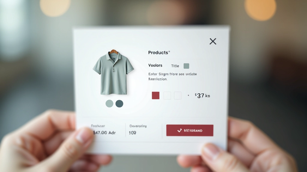
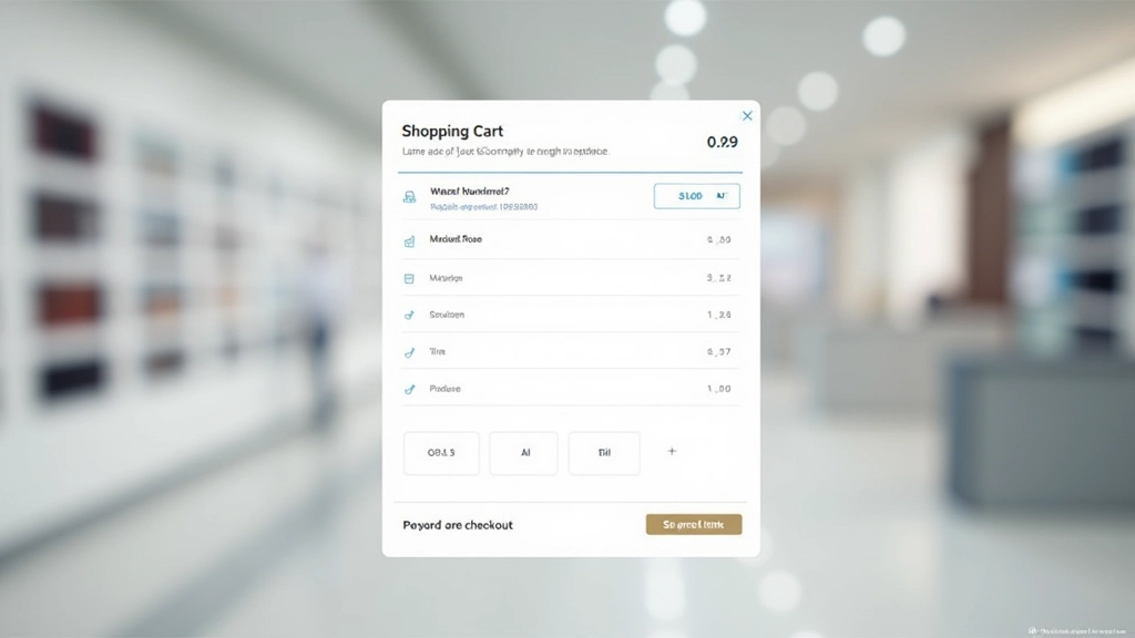
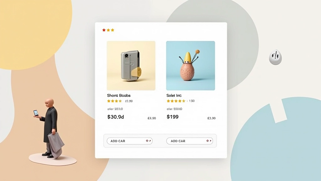
Product Item Cards: Show What Matters
Each product line needs: a small thumbnail, product name, key attributes (size, color, variant), quantity, and price. That’s your foundation. Don’t hide these details behind “view details” links. Customers already made the decision to add this. They just want confirmation.
The quantity input is crucial. Make it big enough to click. Some shops use increment/decrement buttons — that works. Others use a text input — also fine. The mistake is making it tiny or requiring a page refresh. Test both approaches. You’ll find one feels more natural to your customers.
Include a remove link or button, but don’t make it prominent. Subtle, positioned consistently, easy to find when needed but not screaming for attention.
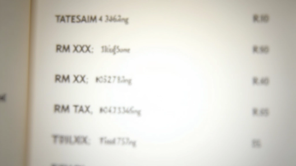
Pricing Transparency Builds Confidence
Subtotal, shipping, tax, discount. Show each line. Your customers want to know exactly what they’re paying and why. Hidden fees aren’t clever — they’re abandonment waiting to happen. When shipping costs appear as a surprise at checkout, you’ve already lost them emotionally.
Consider showing estimated shipping upfront. “Shipping will be calculated at checkout” is acceptable, but “Free shipping on orders over RM150” is better. Give customers control. Let them see what their final number will be before committing.
Use visual hierarchy for the final total. Bigger font, bolder weight, maybe a subtle background color. This number is important — make it feel important. But don’t make it feel alarming. The goal is clarity, not shock.
Micro-Interactions That Matter
The tiny moments between action and response. When someone changes a quantity, does the total update immediately? It should. That feedback is powerful. It confirms their action worked. It builds confidence.
A brief loading state, a subtle color shift, a number that animates from old to new. These aren’t decorative. They’re functional. They tell your customer that the system heard them and responded. Without feedback, they wonder if they need to click again. That’s where abandoned carts live — in the uncertainty.
When someone removes an item, consider a quick confirmation. Not a modal that blocks the entire page. Just a gentle message that says “Item removed. Undo?” That saves customers from accidental deletions. It also shows you respect their attention.

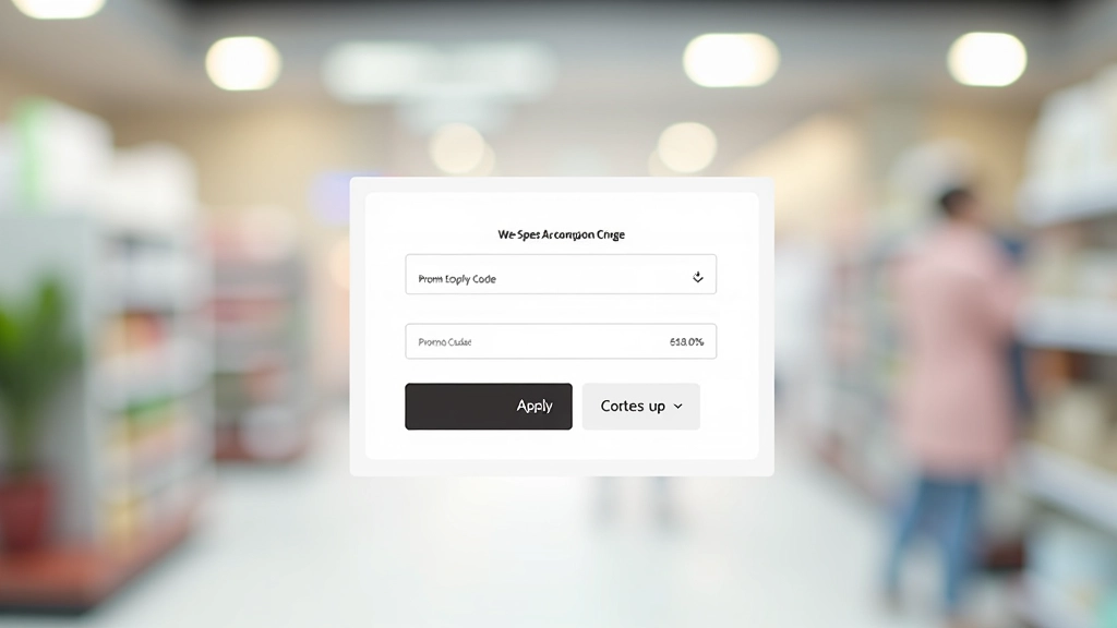
Promo Codes: Make Them Easy
A simple text input field for promo codes. Don’t make it hard to find. It’s not hidden functionality — it’s a common expectation. Most customers have a code or are looking for one. Give them the chance.
When they apply a code, show what happened. “Discount applied: RM50 off” with the new total reflected immediately. If the code doesn’t work, tell them why. “This code expired” or “This code applies only to orders over RM200.” Clear feedback prevents frustration.
Some shops include a prominent “Have a promo code?” link above the input. That works. Others make the input always visible. Test what feels natural on your site. The goal is that no customer feels they’re missing a discount opportunity.
The Checkout Button
Make it obvious. Make it large. Make it a different color from everything else. Your checkout button is doing the heavy lifting. It’s converting a hesitant browser into a committed buyer. Don’t hide it. Don’t make it subtle. It should be the most prominent interactive element on the page after the products themselves.
Consider the language too. “Proceed to Checkout” is clear. “Continue” works. “Buy Now” is direct. Whatever you choose, keep it consistent across your site. Customers shouldn’t have to relearn your interface.
Learn More About Checkout DesignKey Principles
Single Column Layout
Guide attention with a simple, focused layout. Products on the left, totals on the right. Generous spacing between items.
Complete Item Information
Show thumbnail, name, attributes, quantity, and price for each product. No surprises at checkout.
Transparent Pricing
Break down subtotal, shipping, tax, and discounts. Customers need to understand what they’re paying.
Instant Feedback
Update totals immediately when quantities change. Show confirmation when items are removed. Make every action feel responsive.
Easy Promo Code Entry
Don’t hide the promo code field. Make it visible and straightforward. Show what discount was applied.
Prominent Checkout Button
Make it large, colorful, and unmissable. This button converts hesitation into commitment. Don’t be subtle.
Educational Information
This article provides general design guidance for e-commerce shopping cart interfaces. Design decisions should be tested with your specific audience and business model. What works for one store may need adaptation for another. Consider your customer demographics, product types, and regional preferences when implementing these principles. Mobile testing and user feedback are essential for optimizing your cart experience.
Related Articles
Product Card Design That Sells
How to structure product cards with the right information hierarchy. Includes image sizing, typography, and button placement strategies.
Read Article
Checkout Page Composition for Conversions
The science behind checkout flows. Learn how form field organization, progress indicators, and trust signals impact completion rates.
Read Article
Category Page Hierarchy and Navigation
Creating category pages that help customers find products. Covers navigation structure, filtering options, and visual organization patterns.
Read Article