Product Card Design That Sells
How to structure product cards with the right information hierarchy. Includes image sizing, text placement, and call-to-action positioning for maximum conversions.
Read MoreMaster product cards, shopping carts, checkout flows, and category hierarchies that actually convert. Learn how modern online stores are designed from the ground up.

Deep dives into the components that make successful online stores work
How to structure product cards with the right information hierarchy. Includes image sizing, text placement, and call-to-action positioning for maximum conversions.
Read More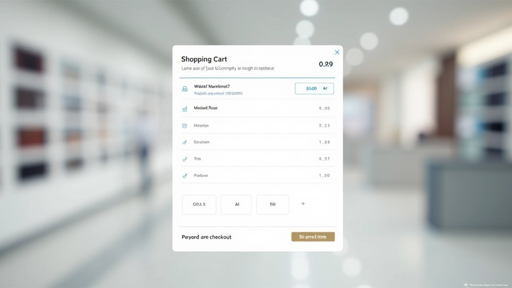
What makes a shopping cart easy to use. We’ll cover item display, quantity controls, coupon fields, and those crucial micro-interactions that prevent cart abandonment.
Read More
The science behind checkout flows. Learn how form field organization, progress indicators, and trust signals reduce friction and increase completed purchases.
Read More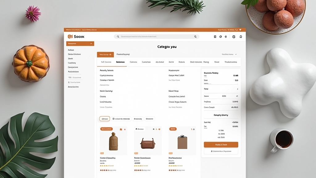
Creating category pages that help customers find products. Covers navigation structure, filtering options, sorting controls, and breadcrumb implementation for better user flow.
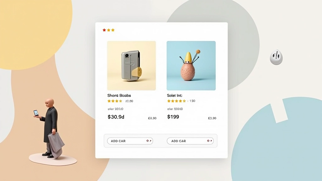
Read MoreClear, logical organization of product information helps customers make decisions faster. Start with what matters most — image, price, availability — then layer in details.
Size, color, and spacing guide the eye to important elements. Product images should dominate cards. Call-to-action buttons need breathing room. Prices must stand out.
Over half of e-commerce traffic comes from phones. Design cards, checkout flows, and navigation for small screens first. Desktop experience follows naturally from there.
Every design decision should reduce friction in the buying journey. Fewer form fields, clearer pricing, visible trust signals — these aren’t nice-to-haves, they’re essentials.
E-commerce design isn’t about aesthetics alone — it’s about removing barriers between browsers and buyers
Well-designed product cards can increase click-through rates by 30-40%. A streamlined checkout reduces cart abandonment by up to 20%. When categories are properly organized with good navigation, average order value climbs because customers find more of what they want.
But here’s what matters most: customers don’t think about design. They just notice when it’s missing. A confusing product page makes them leave. A checkout process with too many steps gets abandoned. Poor category navigation sends them to a competitor.
The stores winning in Malaysia and across Asia understand this. They invest in design that feels invisible — where everything just works. Product information is clear. Prices are visible. Trust signals are obvious. The path to purchase is straight.
“Design is how it works. When customers navigate your store easily, find products quickly, and check out without friction, that’s good design. They won’t praise it, but they’ll come back.”
— E-commerce Design Principle