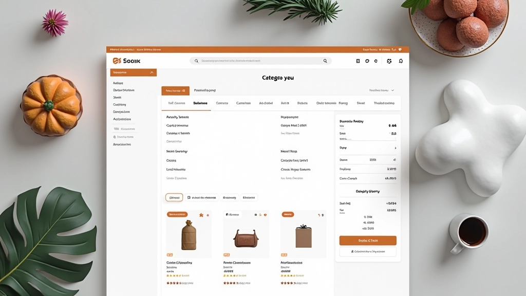
Category Page Hierarchy and Navigation
Building category pages that help customers find exactly what they’re looking for. Learn how to structure navigation, organize filters, and guide shoppers through your product catalog.
Why Category Pages Matter
Category pages are often overlooked, but they’re where most shopping journeys actually happen. A customer lands on your site, skips the homepage, and goes straight to a category. That’s where the real work begins.
The difference between a poorly organized category page and a well-designed one? It’s the difference between a customer finding what they need in 30 seconds and abandoning their cart in frustration. We’re talking about conversion rates that can shift by 15-20% depending on how you structure your navigation and filters.
This isn’t about fancy animations or trendy design. It’s about making sure customers don’t get lost, don’t feel overwhelmed, and can actually find products. Let’s break down what works.
The Breadcrumb Foundation
Breadcrumbs aren’t decoration. They’re a critical navigation element that shows customers exactly where they are in your store’s hierarchy. A customer browsing “Home > Men’s Clothing > Shirts > Casual Shirts” knows immediately where they are and how to get back.
Here’s what we’ve found works best: keep breadcrumbs at the very top of the category page, use forward slashes or arrows for separation, and make sure each level is clickable. Don’t overcomplicate it. Most online stores work best with 3-5 levels maximum.
The breadcrumb text size matters too. It shouldn’t compete with your main navigation. We typically use 12-14px with a slightly muted color (around 60% opacity) so it’s visible but not intrusive. It’s there when customers need it, invisible when they don’t.

Smart Filtering Systems
Filters are where category pages either shine or fail. A customer with 500 shirts to browse doesn’t want to scroll through all of them. They want to narrow it down: size, color, price range, maybe material.
The best approach we’ve seen is a left sidebar on desktop with collapsible filter groups. Each filter should show how many items match that criterion. So instead of just “Blue,” it shows “Blue (24)” so customers know there are actually blue shirts available. This reduces click friction significantly.
Mobile changes the game. A sidebar doesn’t work on a 375px screen. Use a slide-out drawer or a dedicated filter modal. Make sure customers can see both the filters AND the products — don’t hide one to show the other. We typically use a 70/30 split on desktop (sidebar/products) and a collapsible drawer on mobile that overlays the products.

Sorting and Organization
Sorting controls go in the top right corner of your product grid. We typically see 4-6 sorting options that actually matter: Newest, Best Sellers, Price (Low to High), Price (High to Low), Customer Rating, and sometimes Discount Percentage.
Don’t overthink this. Extra sorting options just create decision paralysis. A customer knows what they want — they either want the cheapest option or the most popular one. Give them that and get out of the way.
One thing we’ve noticed: the default sort matters more than you’d think. Setting your default to “Best Sellers” or “Recommended” performs better than “Newest” in most categories. It signals to customers that you’re showing them the good stuff, not just what’s latest.
Product Grid Layout and Card Design
The actual product cards are where category page hierarchy becomes visual. Each card needs to show just enough information without overwhelming the customer. We’re talking product image, name, price, and maybe a rating or quick badge.
A standard grid on desktop is 4 columns. On tablets, drop to 2-3 columns. On mobile, go to 2 columns (not 1 — that wastes vertical space). Each card should be responsive and maintain a consistent aspect ratio.
Hover states matter here. When a customer hovers over a card, show them a quick action — “Add to Cart” button or “View Details.” Don’t make them click into the product page just to add something to their cart. That extra step kills conversions.
Product images are critical. Show the product on a clean background (not a lifestyle shot in this context). Make sure the image is large enough to see details. A 300x300px image is too small — go for 400x500px minimum on desktop.
Pagination and Infinite Scroll
This is a debate that never ends: pagination versus infinite scroll. The answer? It depends on your audience and what you’re selling.
Pagination (Page 1, Page 2, etc.) gives customers control. They know how many results exist and can jump to a specific page. It’s predictable. Infinite scroll feels modern and keeps customers scrolling, but it can be disorienting — customers lose track of how far down they’ve gone.
For most e-commerce, we recommend traditional pagination with 20-30 items per page. It’s not flashy, but it works. If you do use infinite scroll, make sure you’ve got a “Back to Top” button that’s always accessible. And don’t go overboard loading 100+ items at once.

Mobile Category Pages: A Different Game
Mobile shopping is now 60%+ of traffic for most online stores. Your category page needs to work differently on phones.
Navigation Drawer
Don’t cram a breadcrumb and filters into a 375px screen. Use a hamburger menu that slides in from the side. Filters become a modal that opens on top of the products. Keep it clean and let customers toggle filters without losing their place.
Sticky Header
On mobile, make your sorting dropdown sticky at the top. As customers scroll through products, they should always have access to sort and filter controls. Don’t bury these options below the fold.
Two-Column Grid
Mobile screens are narrow but tall. A 2-column product grid works better than 1-column (too much scrolling) or 3-column (images too small to see). Each product card should be touch-friendly with enough spacing.
Build Category Pages That Convert
A well-structured category page isn’t glamorous. It won’t win design awards. But it’ll reduce bounce rates, increase average order value, and make customers actually want to shop with you. That’s what matters.
Explore More Design TopicsAbout This Guide
This article provides general information about e-commerce category page design best practices based on common industry approaches and user experience research. Design choices depend on your specific business model, product type, and audience. Always test your implementations with real users to ensure they meet your particular needs. The techniques described here represent common approaches but aren’t universal solutions — customize them based on your analytics and customer feedback.
Related Articles
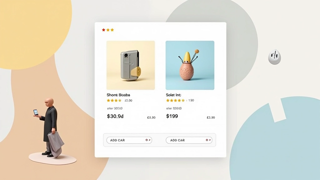
Product Card Design That Sells
How to structure product cards with the right information hierarchy. Includes image optimization, pricing display, and quick action buttons that actually convert.
Read Article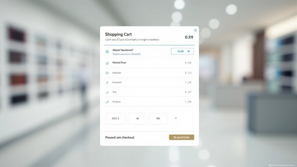
Building Effective Shopping Cart Interfaces
What makes a shopping cart easy to use. We’ll cover item display, quantity controls, shipping estimates, and abandonment prevention techniques that work.
Read Article
Checkout Page Composition for Conversions
The science behind checkout flows. Learn how form field organization, progress indicators, and trust signals impact completion rates and reduce cart abandonment.
Read Article