Product Card Design That Sells
How to structure product cards with the right information hierarchy. Includes image sizing, text placement, and call-to-action positioning for maximum conversions.
Why Product Cards Matter
Your product card is the first real interaction a customer has with what you’re selling. It’s not just a pretty box with an image — it’s a sales tool. Done right, it’ll make someone stop scrolling and click. Done wrong, they’ll never even notice it exists.
We’ve looked at what works across hundreds of e-commerce sites in Malaysia and beyond. The difference between a card that converts and one that doesn’t often comes down to a few specific decisions about layout, spacing, and what information goes where. It’s not magic. It’s intentional design.

The Four Essential Zones
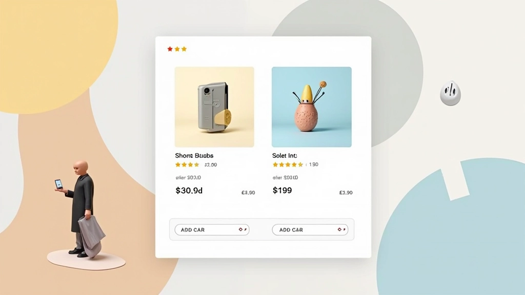
Think of your card as having four distinct zones. Each serves a purpose. Image at the top gets attention. Product name tells them what it is. Price and rating build confidence. The button makes them act. Sounds simple, but most cards get this backwards.
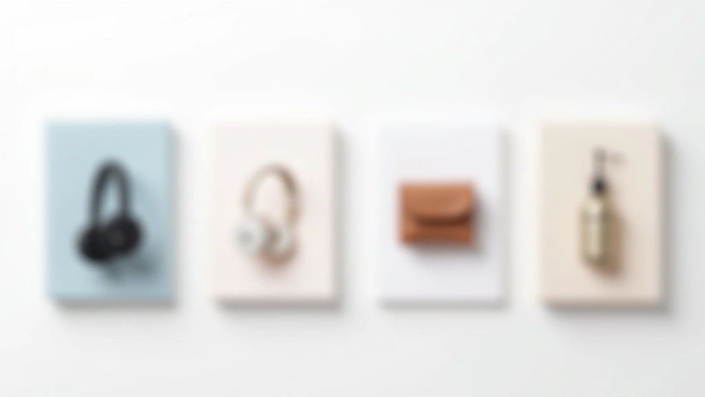
Image Zone (50-60% of card height)
Your image needs breathing room. A 1:1 square ratio works best for consistency across grids. Leave a 16px margin around the image inside the card. This prevents the photo from feeling cramped and makes the whole card feel more premium.
Title & Category (text)
Product name should be 14-16px, never smaller. Two lines maximum — if it’s longer, you’ve got a naming problem. Add a subtle category label above in 11-12px. This helps people scan quickly through your catalog.
Social Proof & Price (16px height)
Rating stars plus review count. Then price right below. Put the sale price in bold if there’s a discount. People need to see value instantly. This zone shouldn’t exceed 16px in height — keep it compact.
Action Zone (button)
Button takes up full card width minus padding. Make it 44px tall minimum — thumb-friendly on mobile. Text says “Add to Cart” or “View Details,” not “Click Here.” The color should pop from your card background.


Spacing Rules That Work
Here’s what we’ve seen work consistently. Card padding should be 16px on all sides. That’s your baseline. Between image and text, add 12px. Between text blocks, 8px. Between the last text and the button, 16px again. You’re creating visual rhythm — not cramming everything together.
The gap between cards in your grid matters too. At 20px horizontal and vertical spacing, cards feel part of a collection. Less than that, they feel cramped. More than 24px and they start feeling isolated. Test it with your own products. Every brand is different.
On mobile? Cards should be full-width minus padding. Two-column grids work if you’ve got space, but single column usually converts better. People aren’t scrolling sideways on phones — they’re scrolling down. Make it easy for them.
Image Treatment & Sizing
Your product image is everything. It’s usually the reason someone clicks. Here’s what matters: size, consistency, and breathing room.
Aspect Ratio
1:1 (square) is standard. It tiles perfectly, doesn’t leave empty space, and feels balanced. Some brands use 4:5 (portrait) which works for fashion. Avoid 16:9 — it wastes vertical space and looks awkward on mobile.
File Size & Format
WebP format, 150-250KB per image. Smaller than JPG, better quality. Your cards load in milliseconds, not seconds. People are impatient. A slow card is an invisible card.
Background Color
White or very light gray behind the image. No gradients, no patterns. The product should be the star. A clean background lets people focus on what they’re buying. Shadows around the image add depth — 0 4px 12px rgba(0,0,0,0.1) works beautifully.

Buttons That Get Clicks
Your button is the conversion point. Make it impossible to miss. Full-width card width minus padding. Height 44-48px — thumb-friendly. Text should be white on color, not color on white. It’s more scannable, more obvious, more action-oriented.
The button color should contrast strongly with your card background. If your card is light gray, your button needs to pop. That’s usually your brand primary color. On hover, it gets slightly darker or has a subtle lift (2-3px transform). This micro-interaction makes it feel responsive.
Button text matters. “Add to Cart” outperforms “Buy Now.” “View Details” works for product pages. Keep it short — one or two words maximum. People scan, they don’t read. Make your intention crystal clear in the fewest words possible.
Consider a secondary action too. A heart icon for wishlist. A share icon. These don’t hurt conversion and give people options. They make the card feel interactive and alive.
The Checklist
Before you ship your product cards, run through this. It’s taken from cards that actually convert:
Get these fundamentals right and you’ve got the foundation for conversion. The rest is testing and refining based on your actual customer behavior. Every product category is different. Every audience has preferences. But these principles work across the board. They’re not trends. They’re not magic. They’re just good design doing its job — getting out of the way and letting people buy what they want.
Information & Context
This guide provides educational information about product card design principles and best practices. The design recommendations are based on common e-commerce patterns and user experience research. Actual conversion results vary depending on your specific products, audience, industry, and implementation. We recommend testing these approaches with your own customer data. Every online store operates in different contexts — what works for one brand may need adjustment for another. Use these guidelines as a foundation, then validate through your own testing and analytics.
Related Articles